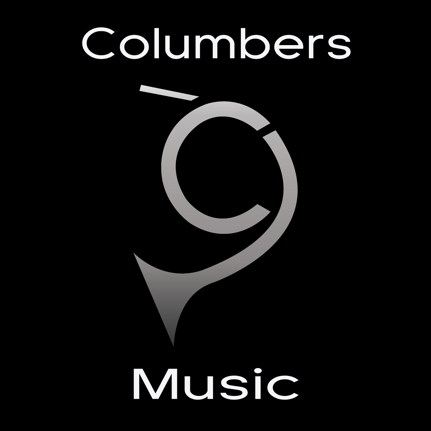
I made this logo for myself recently and put it onto my YouTube, Newgrounds, and stuff. I desperately needed to replace my extremely amateur YouTube "logo" and this was my result. I'm in a graphic design class at school, and these couple of months are all I've had at any sort of art thing. It has a nice little gradient thingy, awesome! Ok.
Also, the french horn is a C, as in "Columbers."
So, my question is... does it suck...?

AceMantra
No, it doesn't suck. It's actually a neat idea. A french horn is fitting since you're a musician, and the inclusion of the "C" is quite clever. However there is always room for improvement.
The viewer's eyes will naturally want to read from left to right. They will also follow where the lines are traveling. So starting with your logo the viewer will want to start at the mouth-end of the french horn and follow the curves down to the other end. Now the the eyes are focused at the other end with nowhere to go, the eyes will naturally want to skip to the next line which is the word "Music." The problem with your "C" in your logo is that it's not on that path of travel so many people may overlook it. That is a shame because I think it's a really cool idea. You could try making the "C" more obvious by adding a design element such as texture or color.
This comment is already too long. PM me if you would like some ideas or more critiquing.
Columbers
Haha thanks for replying. The letter C is just a subtle thing I came up with, and the subtlety is why I like the idea. And I chose a French horn because I played it for 5 years, so I'm quite attached to the particular instrument.
Also I'm unexperienced with graphic design to the point where it's pretty funny, so this was just something I wanted to try, and it worked decently.